-
Traffic
Get More Traffic
SponsoredLinX offers a number of different services to help drive more qualified traffic to your website. Google Ads Management Search Engine Optimisation Microsoft Ads Facebook Advertising Google Ads Mobile“SponsoredLinX are a rarity in today’s market place, they promise a lot but deliver more. Our business has grown by over 400% in one month; we are amazed at the difference they have made.”
-
Conversion
Convert More Leads
Our second step is making sure that your website is able to convert the traffic you receive into leads for your business. Optimising your website to convert more leads is important to a profitable campaign. Web Development Convertopages Do It For Me eCommerce Social Media Posts“I just want to say thank you! The changes that you have applied in our AdWords campaign have definitely seen an improvement on click quality and sales for HippityHop.”

Landing Page Optimisation: First Impressions
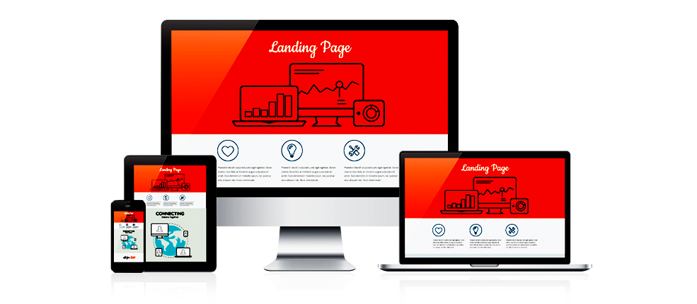
Landing pages … AKA the gift that keeps on giving! If you were to ask any marketer, creative freelancer or small business owner what they value most from their online presence, we’re confident each will respond by saying landing pages.
Why? When visitors are driven to a landing page with the right offer, these visitors turn into leads or customers. Landing pages are created to drive various goals:
- Access gated content (eBooks, white papers etc.)
- Redeem a limited-time offer or discount
- Register for an event, or
- Make an online purchase
We’re often asked how this differs from a website and also what makes a landing page so successful. Well, look no further. In this short article, we’ve summarised what your visitors are looking for and provided tips on what will make them convert after seeing your ad, opening your email, clicking on a hyperlink, or swiping up on an Instagram or Snapchat story.
Branding
It’s important that anyone clicking through to a landing page you’ve developed can immediately recognise your brand. If a visitor gets a mild hint that the landing page strays from the brand they’re just discovering, know, love or trust — it’s game over. They’ll believe there’s a problem with the page, and exit within 3 seconds of it loading. Don’t make this simple mistake.
Top Navigation
Unlike a dedicated website, you don’t want to feature a navigation bar on your landing page that enables visitors to click elsewhere and consume other information you’ve previously published. Always keep in mind that your goal is to make a visitor perform one single action i.e. fill in a form, subscribe to your newsletter or purchase your product/s. Extra navigation will only serve as a distraction, so it’s best to keep it simple with an image and page title in the top banner. For some industries, you could also include a click-to-call contact number.
Messaging
In almost all instances, visitors to your landing page have clicked through or swiped up after seeing an engaging ad or reading one of your messages. For this reason, it’s important you remind them through repetition and a quick deep dive of why they should share their details with you, or fulfil a transaction. If you’re not already, take a minute to ponder “what is my value proposition?” Here, we also recommend you integrate some graphics, images or vital stats e.g. ‘X’ people are going to this event; or only ‘Y’ hours remain until this offer expires. Another option is to feature a testimonial of your company, product or services. You’d be surprised how effective this is in building confidence with the web visitor that they’re about to do the right thing.
Forms
Here, you want to make sure the form is:
(a) easy to see or navigate to,
(b) isn’t overly complicated to input the required details, and
(c) if the visitor is purchasing a product or service you specify how many form pages are part of the entire process.
Always keep in mind: time is a form of currency, and nobody wants theirs to be wasted. So the more convenient it is to submit one’s details, the higher chance you have of capturing that new lead or customer.
Pro Tip #1
If your landing page requires a lot of scrolling on mobile devices, integrate a CTA (call to action) button that, when clicked on, takes your visitor to the bottom of the page where your form is located.
Pro Tip #2
Make it easy for your customer to complete the form or transaction. If the visitor has come from a social media channel or an email you circulated to your database … do the heavy lifting for them by pre-populating the form with the details you have and are asking for. By implementing this last tip, you’ll be a titan of your industry like Amazon who pioneered 1-click ordering.
Having your landing page optimised to its full potential removes any chance of people clicking away dissatisfied. First impressions count, so make yours great! For more information, contact our digital marketing experts at SponsoredLinX on 1300 859 600!

